Be Prepared For The Toughest Questions
Practice Problems
Question-1 : Create a circle map as shown below to encode population and population density for New Your Borough. What key observations can you make from the visualization?
Question-2 : Create a circle map as shown below to visualize average global internet usage rates by country, from 2000 to 2010. What key observations can you make from the visualization?
Question-3 : Duplicate the visualization of question-2 and modify it to show filled map as shown below.
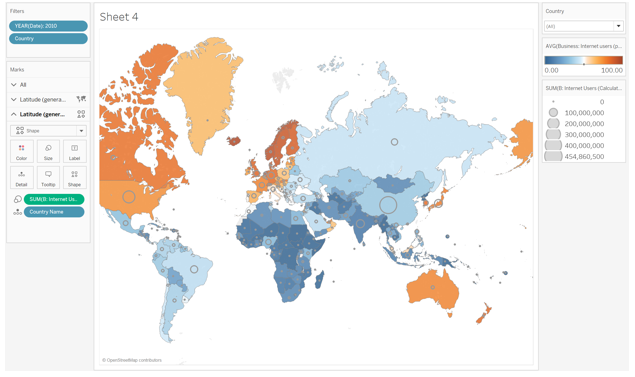
Question-4: Duplicate the visualization of question-3 and modify it to show Dual axis map, in which color shows internet usage rate as before and the size of the circle shows number of internet users. Refer to slides 36 and 37 of the CD chapter 10.
Question-5: Create the exploratory dashboard as shown in the figure below. In particular, implement the first 5 steps that the book discusses.
Know the process
Students succeed in their courses by connecting and communicating with
an expert until they receive help on their questions

Unable to find what you’re looking for?
Consult our trusted tutors.


 Login | Sign Up


