The Happy Planet Index
The website TED.com offers free short presentations, called TED Talks, on a variety of interesting subjects. One of the talks is called “The Happy Planet Index,” by Nic Marks.
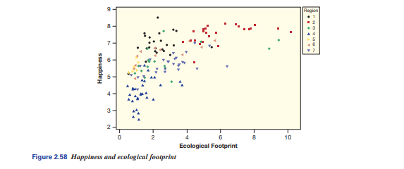
Comments that we regularly measure and report economic data on countries, such as Gross National Product, when we really ought to be measuring the well-being of the people in the countries. He calls this measure Happiness, with larger numbers indicating greater happiness, health, and well-being. In addition, he believes we ought to be measuring the ecological footprint, per capita, of the country, with larger numbers indicating greater use of resources (such as gas and electricity) and more damage to the planet. Figure 2.58 shows a scatterplot of these two quantitative variables. The data are given in HappyPlanetIndex.
(a) Does there appear to be a mostly positive or mostly negative association between these two variables? What does that mean for these two variables?
(b) Describe the happiness and ecological footprint of a country in the bottom left of the graph.
(c) Costa Rica has the highest Happiness index. Find it on the graph and estimate its ecological footprint score.
(d) For ecological footprints between 0 and 6, does a larger ecological footprint tend to be associated with more happiness? What about for ecological footprints between 6 and 10? Discuss this result in context.
(e) Marks believes we should be working to move all countries to the top left of the graph, closer to Costa Rica. What attributes does a country in the upper left of the graph possess?
(f) This graph shows a third variable as well: region of the world. One way to depict a categorical variable on a scatterplot is using different colors or shapes for different categories.
The code is given in the top right, and is categorized as follows: 1 = Latin America, 2 = Western nations, 3 = Middle East, 4 = Sub Saharan Africa, 5 = South Asia, 6 = East Asia, 7 = former Communist countries.
Discuss one observation of an association between region and the two quantitative variable
(g) If the goal is to move all countries to the top left, how should efforts be directed for those in the bottom left? How should efforts be directed for those in the top right?
Students succeed in their courses by connecting and communicating with an expert until they receive help on their questions

Consult our trusted tutors.


 Login | Sign Up

