

 Login | Sign Up
Statistics
Introduction to Descriptive Statistics
Share


Quantitative measures
Share
Frequencies, Percentiles and Quartiles
Share
Frequency
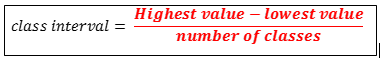
1. Frequency Distribution
Frequency is a number of times a particular value occurs. By counting frequencies, frequency distribution can be constructed. A frequency distribution consists of class interval and corresponding frequencies. In excel best way to construct frequency distribution is using Pivot table.
2. 2k Rule
According to 2k rule, 2k >= n; where k is the number of classes and n is the number of data points.
| k | 2k |
| 0 | 1 |
| 1 | 2 |
| 2 | 4 |
| 3 | 8 |
| 4 | 16 |
| 5 | 32 |
| 6 | 64 |
| 7 | 128 |
| 8 | 256 |
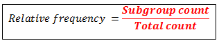
3. Relative Frequency
Relative frequency is the percentage of observations on a particular class interval.
3. Cumulative Relative Frequency
Cumulative frequency is defined as the sum of all relative frequencies preceding the relative frequency of particular class interval.

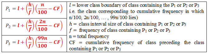
Percentile
The 99 values which divide data (arranged in ascending order) into 100 equal parts are known as percentiles.
For un-grouped data percentiles can be calculated using following formula:

For grouped data percentiles can be calculated using following formula:
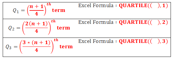
Quartiles
The 3 values which divide data (arranged in ascending order) into four equal parts are known as quartiles. They are named as first (lower quartile), second (median) and third (upper quartile) quartiles which are denoted by Q1, Q2 and Q3 respectively.
For un-grouped data quartiles can be calculated using following formula:
For grouped data quartiles can be calculated using following formula:

Charts And Graphs
Share
Stem and Leaf Plot
The stem is used to group the scores and each leaf indicates the individual scores within each group. Example:

Histogram
The histogram is a graphical display of frequency distribution of data. The easiest method for construction if the histogram is using Pivot tables in Excel. Histogram tells me about the shape of the distribution.
Histogram can also be constructed with help of 2k Rule
The shape of the Histogram can be Symmetric (Normal), Positively skewed, negatively skewed and Bimodal.
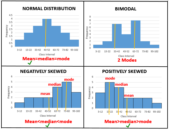
Symmetric (Normal): If it is bell-shaped I can say data is normally distributed. For a normal distribution, mean is the best measure of central tendency.
Positively skewed: If histogram has a tail toward the right, it is said to be skewed to the right. A positively skewed data implies that there are very few observations with high values. Here, mean is greater than median which is greater than the mode. For a skewed data, the median is the best measure of central tendency.
Negatively skewed: If histogram has a tail toward the left, it is said to be skewed to the left. A negatively skewed data implies that there are very few observations with low values. Mean is less than median which is less than the mode. For a skewed data, the median is the best measure of central tendency.
Bimodal: Here 2 modes can be observed.
Box Plot
Box-plot indicates if there are any outliers in the dataset. Any point outside the box is considered as an outliers. The lower line of the box is 1st Quartile, the middle line is the median and upper line is 3rd Quartile. Box Plot is also a measure of Symmetry.
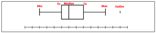
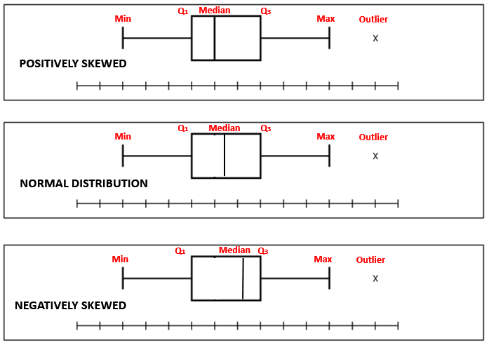
Box Plot is also a measure of Symmetry. It can tell us about the shape of underlying distribution.
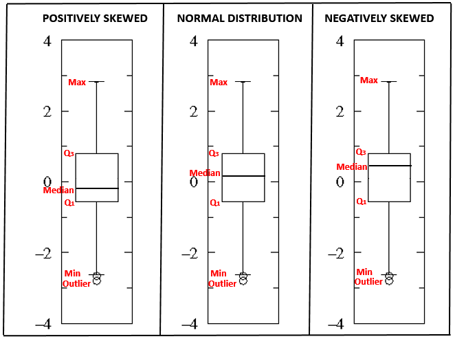
Normal Distribution: If the line is close to the center of the box and the whisker lengths are the same then the sample is from symmetric (Normal) population.
Positively skewed: If the top whisker is much longer than the bottom whisker and the line is gravitating towards the bottom of the box, then the sample is from a population which is skewed to the right.Here, mean is greater than median which is greater than the mode. For a skewed data, the median is the best measure of central tendency.
Negatively skewed: If the bottom whisker is much longer than the top whisker and the line is rising to the top of the box, then the sample is from the population which is skewed to the left. Here, mean is less than median which is less than the mode. Here, mean is less than median which is less than the mode. For a skewed data, the median is the best measure of central tendency.
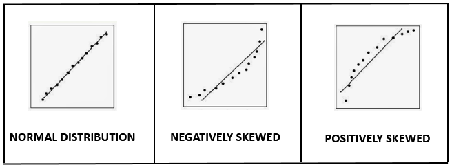
PP Plot and QQ Plot
PP plot indicates whether data follows a normal distribution. If its graph is S-shaped, data is normally distributed. Else if data is not normally distributed. It plots the corresponding areas under the curve (cumulative distribution function).
QQ plot indicates whether data is skewed to right or left. Here the actual values of X are plotted against the theoretical values of X under the normal distribution. The use of Q–Q plots is to compare the distribution of a sample to a theoretical distribution, standard normal distribution.
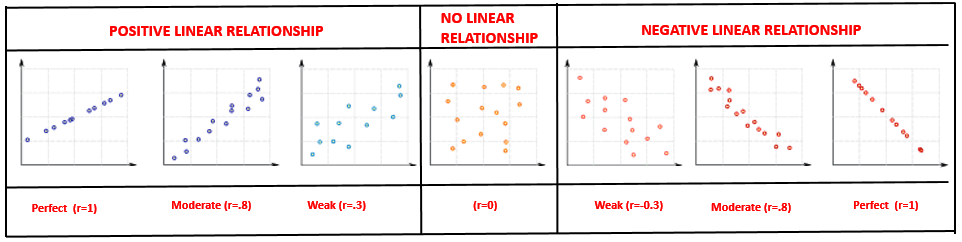
Scatterplot
Scatterplot tells me strength and direction of the linear relationship between two variables.
Central Tendency
Share
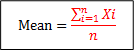
Mean
Mean (also known as expectation or average) is defined as the sum of all deviations divided by the total number of observations. Mean is considered as the best measure of central tendency when data is normally distributed.
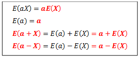
Some properties of expectation (mean) for a random variable X are:
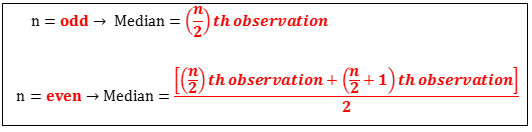
Median
Median is defined as the middle value in a series of data when arranged in ascending order of importance. The median in a series of ordered (ascending) values is the value at which there are just as many values less than it as there are greater than it. Median is considered as the best measure of central tendency when data is skewed or has outliers.
Mode
The mode is defined as the observation which occurs a maximum number of times. The mode is the number with the highest frequency. The mode is considered as the best measure of central tendency when data is measured on the nominal scale of measurement.
Variability
Share
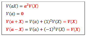
With the addition of a constant value to each observation in a dataset, there is no change in the values. Hence all measures of variability are unchanged by the addition of constant value.
With the multiplication of a constant value to each observation in a data set the distance between values changes. Hence new range, interquartile range (IQR), and the standard deviation are constant multiplied by old range, interquartile range (IQR), and standard deviation respectively. And new variance is constant multiplied by old variance.
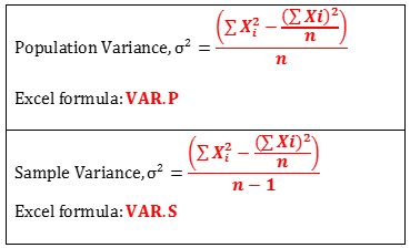
Variance
It is a measure of the spread of distribution about its mean. Variance measures the dispersion in squared units of the data. The less value of variance implies that the mean is reliable. For formula for population variance and sample variance differs in the denominator.
In statistical analysis data in form of sample and hence I use sample variance. Excel functions for population variance and sample variance is VAR.P and VAR.S respectively.
Some properties of variance for a random variable “X” with a constant “a” are:
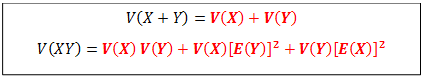
For two random variables X and Y,
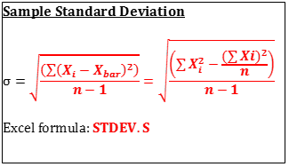
Standard Deviation
It is a measure of the spread of distribution about its mean. Standard Deviation measures the dispersion in original units of the data. The less value of Standard Deviation implies that the mean is reliable. For formula for population variance and sample Standard Deviation differs in the denominator.
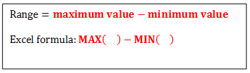
Range
The range is defined as the difference between the lowest and highest values in a dataset.
Interquartile Range
The interquartile range is defined as the difference of 3rd and 1st quartile. It is the best measure of dispersion in when data is skewed or has outliers.


